Branding is about building consistency across your touch points
When I started Mooncrew in 2016 alongside Jake Swesey, I knew that the name needed to have an immediate connection to it’s imagery. You might ask – why, isn’t Mooncrew a record label? What’s that got to do with visuals?
Everything!
You see – in 2020 and beyond, more and more of our customers, clients, fans, and business partners will be discovering us online. Spotify and Apple Music have already rolled out beta versions of moving visuals to accompany music, and YouTube Music is a secret smash hit solely because people like to look at something while they listen.
Back to Mooncrew: all of this that meant that day one before we even came up with the name, we knew that the name needed to have visual context and vice versa. Hence – MoonCrew Unlimited, or MCX for short. Mooncrew has an obvious logo mark – a simple, filled in circle. It’s nothing ground-breaking and certainly not copyright-able on it’s own.
However, when in context with careful color considerations and font choice, design placements and palette choices; we quickly settled on a variety of iterations over the years that are pleasing to the eye, remarkable for recollection, simple, and reusable.
Below you can see a few implementations of the logo and how it’s evolved over the years:
2016 – On an event poster
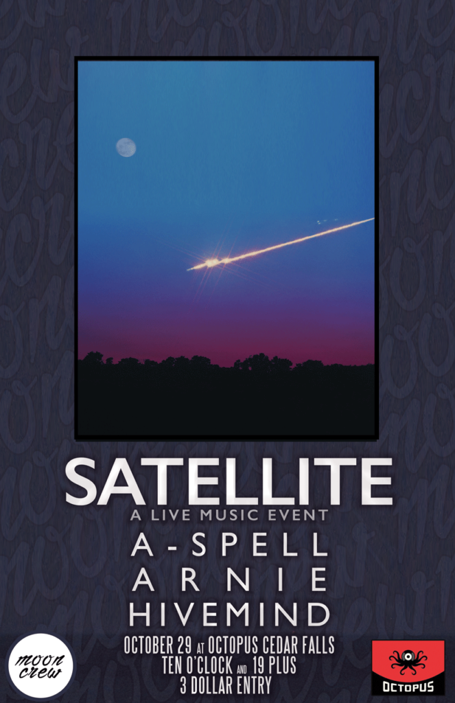
Back then the logo was ‘the moon coming up during a sunset on a summer day’; a moonrise with a sweltering, italicized script-like font to complete the logo mark.
2019 – On an album release
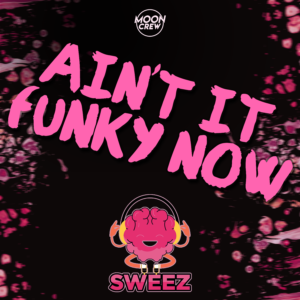
A logo mark evolved into a record stamp – emulating the bygone days of ripping the plastic off of the CD before throwing it into your ’98 Ford Taurus.
2020 – In an album teaser
A logo turned into a movie trailer preroll, the circle mark can be easily pseudo animated simply by making it rise and fall.